
In March 2021, Research England and Jisc data analytics released the first dashboards from the Knowledge Exchange Framework (KEF). A pioneering project aiming to showcase the value of knowledge exchange between higher education (HE) in England and its diversity of partners. I covered the release in detail at the time and you can find out much more about the dashboards and the background of KEF in the original article.
Introducing KEF 2
Fast forward 18 months, and we now see the highly anticipated release of KEF 2 – the next generation of dashboards from the framework delivering methodological and user-focussed improvements, along with enhanced and updated data on the knowledge exchange activities of the sector.
Research England’s review of the first iteration highlighted its successes as a novel performance framework in knowledge exchange (KE), but also indicated technical changes to further improve the KEF. In this article, I explain some of the key changes and how they aim to further improve the representation of the sector’s knowledge exchange activities and help users find the KE intelligence they need.
“Knowledge exchange is integral to the mission and purpose of our universities, and its importance in contributing to societal and economic prosperity is strongly supported by the Government.
“Today’s new version of the Knowledge Exchange Framework takes further forward the vision and potential of KE activity, providing richer evidence to demonstrate universities’ strengths in different areas when set alongside their peers.”
David Sweeney CBE, Executive Chair of Research England
1 – New dashboard landing page gives users more flexibility
The first, and most obvious change users will see when they access the KEF 2 dashboards is on the initial dashboard landing page. This new feature enhances the accessibility and navigability of individual provider dashboards, giving users the opportunity to search and select which provider is most relevant to them and navigate straight to their data as shown below.

2 – Deciles change to quintiles for more accurate representation
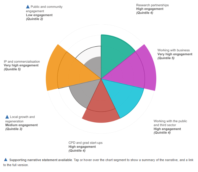
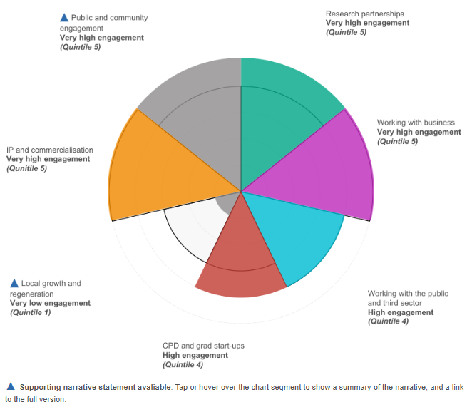
The results of the previous iteration of KEF were displayed in deciles (10 equal groups) with a provider for example, being “in the top 10%” of a particular area of knowledge exchange. In the latest iteration, the results are now shown in quintiles (5 equal groups). This enables a more accurate representation of the relative performance of different providers, due to the nature of the data that underpins the KEF and the knowledge exchange activities it showcases. Quintile 1 represents the lowest quintile working up to quintile 5 which is the highest as shown in the example below. More information can be seen in this supporting document.
3 – New engagement labels add further descriptions to quintile scores
Linked very closely to the previous change, the presentation of a provider’s results has changed alongside the move to quintiles. Rather than providers being “In the top 20%”, their activity is now described by an ‘engagement’ level for that area of knowledge exchange. These labels range from Very low engagement (which matches up with quintile 1), through to Medium engagement (matching up with quintile 3), all the way to Very high engagement (matching up with quintile 5). As the quintiles are labelled numerically (1-5), this qualitive description of relative performance looks to provide a clear and more accurate reflection of the results. You can see the new terminology and quintile system in the example image below.
4 – Perspective name change and the inclusion of sub-headings
Those of you who have used the previous version of KEF may notice that one of its seven main perspectives has changed names. In KEF 2, the perspective: Skills, enterprise and entrepreneurship has evolved to Continuing professional development (CPD) and graduate start-ups to better reflect the metrics and underpinning knowledge exchange activity it now represents.
A further change is the welcome addition of a sub-heading within the dashboards themselves to provide further clarity on the metrics included within each of the perspectives. The additional context these sub-headings provide should improve the overall user experience when using the dashboards and are detailed below for reference.
|
KEF 2 Perspective |
Sub-heading |
|
Public and community engagement |
Self-assessment of maturity in public and community engagement with evidencing narrative statement |
|
Research partnerships |
Through co-authorship and collaborative research income |
|
Working with business |
Income through contract research, consultancy, facilities use, and from Innovate UK |
|
Working the public and third sector |
Income through contract research, consultancy and facilities use |
|
Local growth and regeneration |
Income received for regeneration and development with narrative statement detailing strategy, activity and impact |
|
IP and commercialisation |
Through licensing and intellectual property (IP) income, and spin-out investment and turnover |
|
Continuing professional development (CPD) and graduate start-ups |
Income through provision of CPD and continuing education, and the number of graduate start-ups |
5 – Improvements to the underlying KEF methodology and metric changes
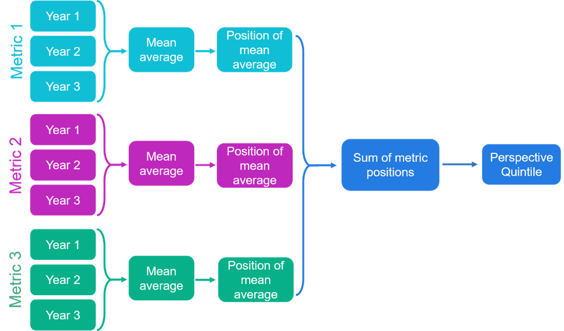
The methodology determining how KEF 2 results are calculated from the underlying data has been developed to further improve the robustness of the results. The new methodology is an evolution of the previous one, but includes the removal of a scaling step to now ensure that the underpinning metrics in a perspective are more equally reflected in the overall final perspective result. This is described in more detail in the KEF 2 decisions document starting at page 12 and an updated methodology diagram can be seen below:
KEF 2 includes a small number of specific changes to the existing KEF metrics to further improve their robustness and accuracy. These are summarised below:
- Research partnerships perspective, co-authorship metric: inclusion of trade journals in the underpinning dataset.
- Continuing professional development (CPD) and graduate start-ups; CPD/CE learner days: removal of this metric due to concerns that its collection in HE-BCI is not sufficiently robust and that it also placed undue emphasis on the two CPD/CE metrics.
- IP and commercialisation perspective; external investment in spin-outs: shift in the denominator used for normalisation from the ‘number of active firms’ to the ‘number of active spin-outs which have survived at least three years’.
6 – Data refresh leads to enhanced insights
Lastly, but by no means least, KEF 2 brings in refreshed data including two completely new years. The dashboards now contain data for the 2018/19, 2019/20 and 2020/21 years and utilise the most recent data currently available.
Explore the KEF 2 dashboards and provide feedback
You can see all of the above upgrades in the full dashboard release on the KEF2 website.
Your ongoing feedback will continue to be vital in shaping future iterations of KEF, so let Research England know what you think of the evolved dashboards and the wider KEF by filling out the dedicated survey. You can also find out more information about the dashboards in the technical notes on the revised website.
Contact Jisc’s data analytics team to discuss your own requirements
We design and develop bespoke data analytics solutions for our members and customers. If your organisation would like to enquire about the design and production of your own higher or further education data analytics dashboards, or your data analysis projects, contact us via the channels below quoting ‘DA-Dashboard 2022’ in your communications.
We look forward to hearing from you.
T: 0333 015 1165
Jisc data analytics on LinkedIn
Author – Matt Clarke, Content Insight Manager, Jisc and contributions from members of Research England.