![]()
In this post I’ll take a quick look at using Sets in Heidi Plus to solve some potentially tricky issues you might have in creating visualisations and reports where you have groups whose members overlap.
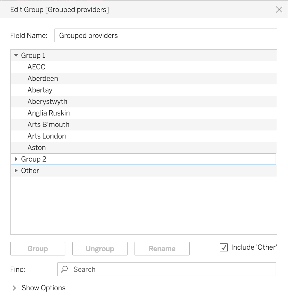
It’s fairly straightforward to create non-overlapping groups in Heidi Plus, for example, if you want to create a new hierarchy of providers. If you right-click Provider short name in a workbook, you can add providers to groups using create > group:
The new groups are then available to use like any other dimension. Below I’ve used it as the dimension for showing average water consumption over time: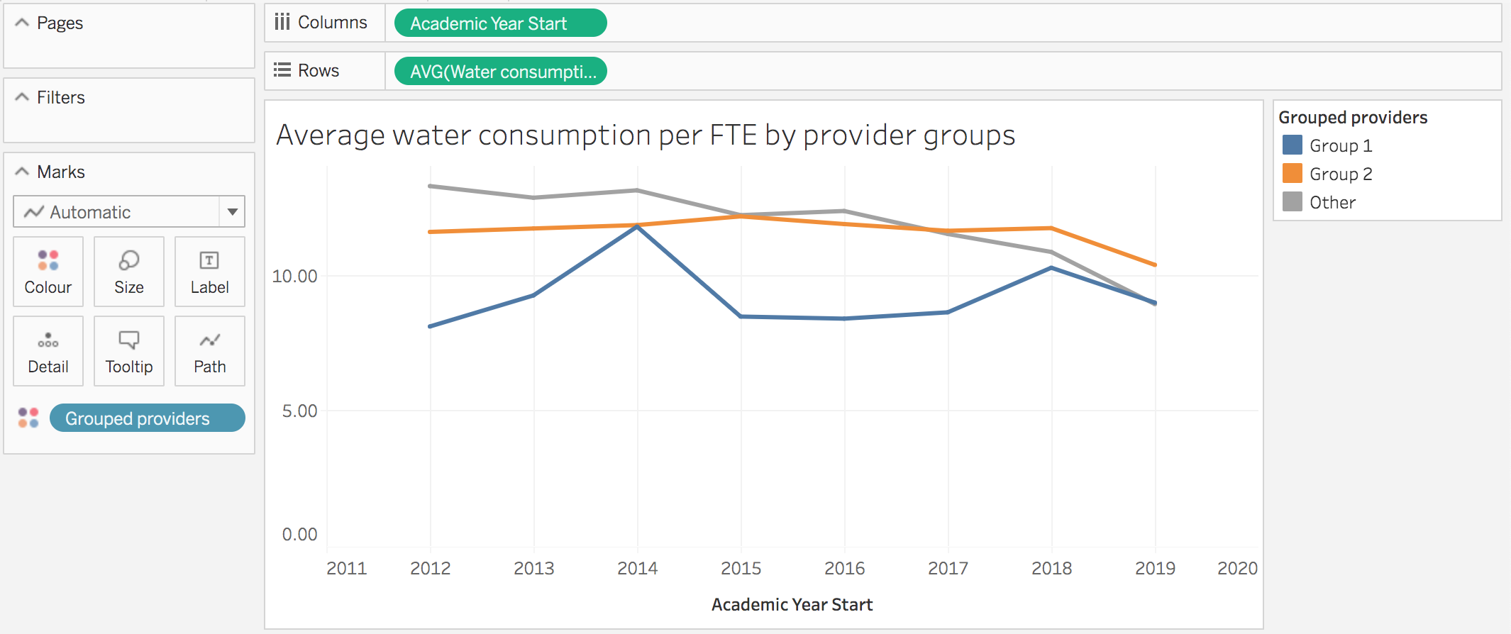
However, what if we want to compare ourselves with all providers in the region, and all in the country?
In this case the members of the groups are overlapping and so using the “Create Group” function won’t work for us.
To do this we need to create Sets instead, and use calculated fields.
To create Sets in Heidi Plus, start by creating a sheet with just the dimension we want to create Sets from. (You can actually use multiple dimensions in a set but let’s keep it simple for now!)
Next, select all the members that belong in the set (you can use shift-click or control-click to do multiple selections). Then, right-click anywhere in the selection and choose Create Set from the context menu. Its found under the ‘linked circles’ icon: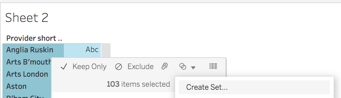
By default this set will be named after the dimension, but you can right-click it in the fields list and rename it to something more useful. You can do this as many times as you need to create all the sets you need. Unlike Groups, each set is independent, so sets can contain the same members.
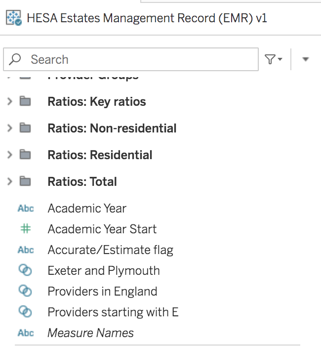
The sets you create are shown along with the other dimensions in the field list.
Below I’ve created three sets of overlapping providers – of dubious value admittedly, but hopefully you get the idea!
I have a set of all the providers in England, one containing just Exeter and Plymouth, and one with all providers that start with the letter E. Exeter is present in all three sets, while Plymouth is in two of them.
We can use sets in calculated fields using the IN operator when we create the formula. We’re going to need to create a calculated field for each measure, for each set used in the view.
To take a simple example, let’s show one of the EMR ratios. In this case, because the measure is a ratio, we want the average for the members of each set.
The general formula for this is:
AVG(if [dimension] in [my_set] then [measure] else NULL end)
For the EMR example, for one of our sets it looks like this:![Formula: AVG( if [Provider short name] in [Providers in England] then [Water consumption per student and staff FTE (total)] else null end )](https://analytics.jiscinvolve.org/wp/files/2022/09/Screenshot-2022-09-23-at-12.31.58.png)
We do the same again, for each set, so that we end up with three measures: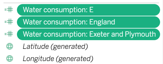
Now we have our calculated fields, we can use them in a view. Because we’re using multiple measures rather than a dimension, we have to use the Measure Names dimension and Measure Values measure rather than select individual fields.
First drag Measure Names to Filters, and select the measures you want to use.
Next, double-click Measure Values to add it to the view.
Finally, drag Measure Names to the colour mark.
To make a more useful view, drag Academic Year Start to columns so you can get a nice line chart like so:
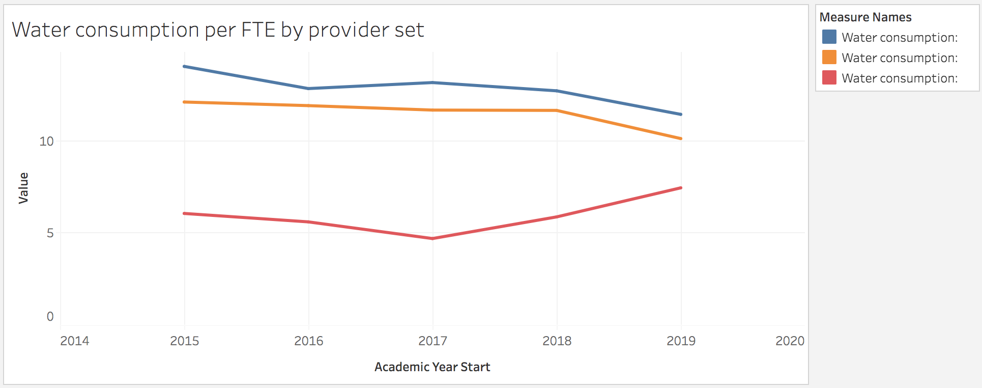
So we now have our measures for each of the overlapping provider groups. Job done!
Because Heidi Plus has a limited space for the legend, we might want to rename those calculations to be a bit shorter, and the labelling isn’t great either, but hopefully this gives you an idea of how to build a chart with overlapping comparator groups.
For example, you could use this approach to benchmark a provider against all in the same region, and against all providers, each as a line in the same chart.
Using the same approach for custom disciplines and faculties
We’ve seen how this works for comparison provider groups, but how about mapping subjects to local disciplines, departments or faculties? In this scenario, we may have local groups defined that span several JACS and CAH subjects with lots of overlaps.
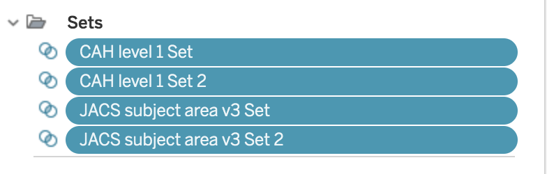
The approach is very similar, except instead of creating Sets for just one dimension, we’re going to create separate Sets for both CAH and JACS.
We start the same way as before by creating views with the dimensions of interest, and building Sets from them. For this example I’m going to rather arbitrarily create “Faculty A” and “Faculty B” sets for various JACS subject areas and various CAH Level 1 subject groups. (I’ve grouped these into a folder to make them easier to find.)
Once we have the sets defined, we need to create the calculated fields. To make things easier, we can create a generic “Subject” field that uses either CAH or JACS depending on the year:![Screenshot of Tableau formula: If [CAH Level 1] != 'Not applicable' then [CAH Level 1] else [JACS subject area V3] end](https://analytics.jiscinvolve.org/wp/files/2022/09/Screenshot-2022-09-22-at-12.01.20-e1663852717565-1024x508.png)
We can use this new field in our calculations in a very similar way to how we did it before for EMR using IN:
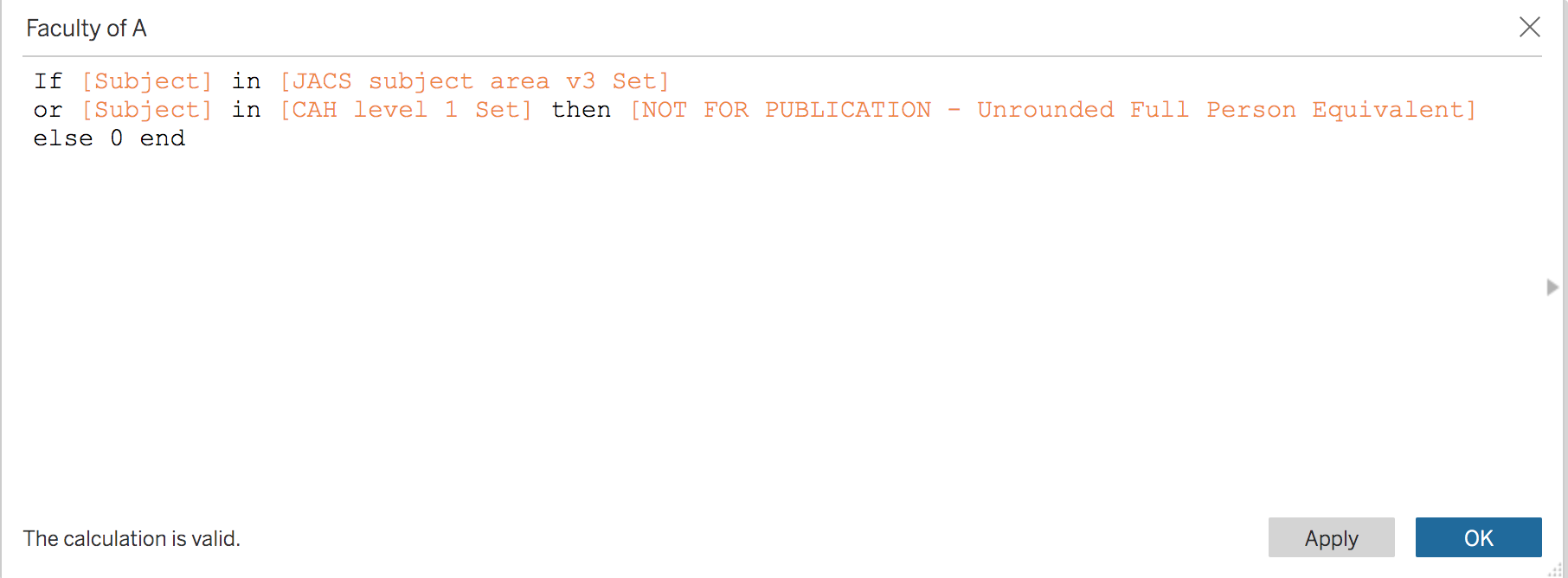
This time we’re creating measures for “Faculty of A” and “Faculty of B” based on whether a subject is in the first set of CAH/JACS subjects, or the second set.
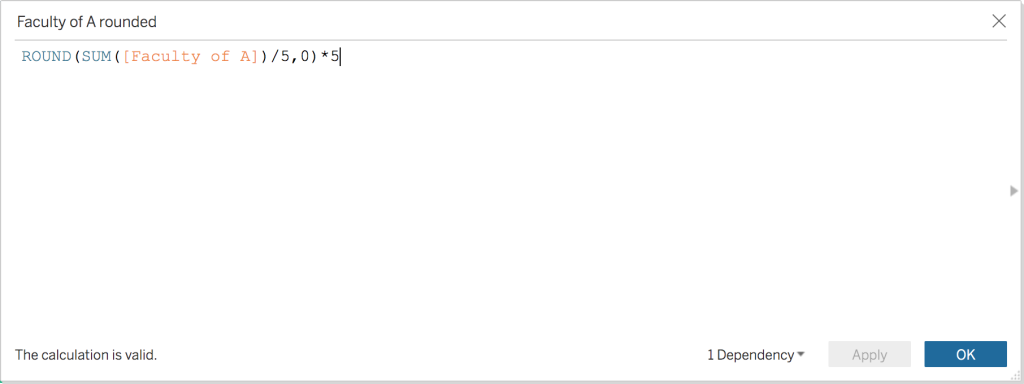
Note that as the formula above used unrounded data, we also need to wrap the SUM in a rounding function:
We can now use this to build a visualisation. (Note because this isn’t a ratio we’re using SUM instead of average to get the aggregate values.)
We also need to exercise some caution here with interpretation – because of the overlap we are double-counting any courses where the subjects are in both Faculty A and Faculty B!
We can use a bit of logic to reduce this effect if we want to:
SUM(
  IF [Subject] IN [Faculty A] THEN
    IF [Subject] IN [Faculty B] THEN [Measure]/2
    ELSE [Measure]
    END
  ELSE
    NULL
  END
)
With this calculation, we’re splitting the overlapping categories by half. It’s a bit arbitrary, but does mean the totals will still add up correctly without any double counting. However, whether this split makes actual sense in your case is a matter of judgement. If the subject sets don’t actually overlap one another, it’s not an issue, but in that case you could just use Groups instead of Sets.
If we were to use an average of ratios instead of sum of totals, the visible effect of doubling up is less pronounced, but is still present in the underlying calculations.
Again, you need to consider how you’re taking this into account when interpreting the results. If for example, the overlap in subjects is between department and faculty, rather than between departments, then the double counting is implicit in the hierarchical relationship between the two, so isn’t misleading.
Summing up
You can use Sets in Tableau whenever you need to split data by dimensions with overlapping members. You can use this for custom benchmark groups, subject groupings, and any other dimensions you’re interested in. Take care though when it comes to double-counting – in some cases, like our first example with benchmarks, this isn’t a problem as this is quite clear from the intention behind the chart. In our second example, it could potentially be misleading!
Acknowledgements
A big thanks to Emma from LSBU who came to me with the original problem that prompted this blog post.
Author – Scott Wilson, Senior data and analytics developer, Jisc
You can also follow us on Twitter and LinkedIn to keep up to date with Jisc data analytics.