![]()
Did you know you can use more than one dataset at a time in Heidi Plus? It’s easier than you might think!
In this post we’ll pull together three different HESA datasets for an admittedly slightly spurious bit of analysis.
There are lots of reasons you might want to blend together data sources. For example, you might want to look at both qualifiers and students as a single population. Or you might want to compare the characteristics of the staff and student populations across providers.
The main requirement is that we have the common keys we need to join the data together; the main ones being the provider and the academic year. Depending on the datasets you’re using, you might also be able to use cost centres, subjects, or geographical dimensions like countries and regions.
For this example I’m going to be looking at the relationship between attendees at public events (as recorded in HEBCI Part B Table 5) and catering and conference income (from Finance Table 7), and then add a parameter so we can filter it based on the size of provider as measured by number of students (from Student Full Person Equivalent).
I did say it was a bit spurious!
First off, we want to include the primary data source. This is important as Tableau blends data between a primary source and any number of secondary sources, and you have the least number of restrictions for what you can do with data from the primary data source.
The primary data source is literally the first data source you include a field from in a worksheet. (If you drag a field from the wrong one at first, you have to remove all the fields and start again to get Tableau to figure out which one you want to be the ‘primary’)
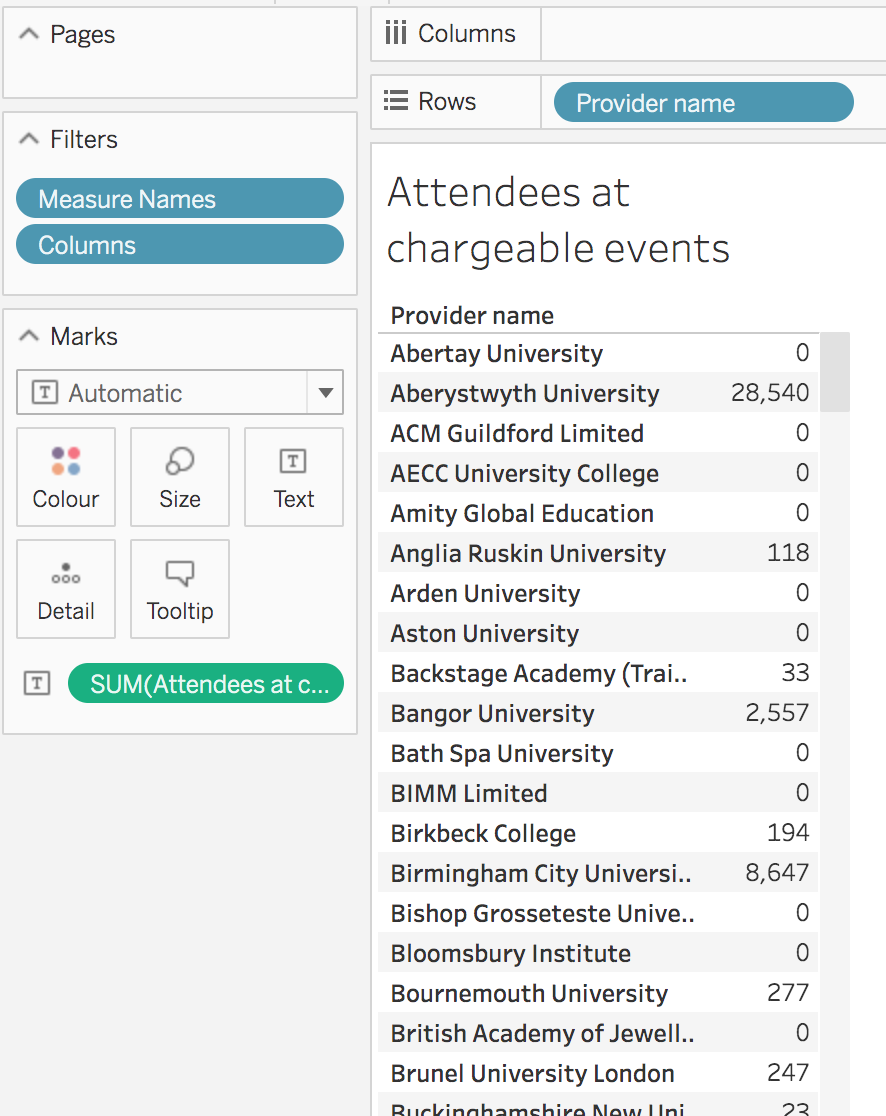
I’ll start by creating a new workbook using HEBCI Part B Table 5 from Silver Data Sources.
I’m interested in the attendees at any chargeable events, so I’m going to create a calculation to pull out just that:![Formula: if [Columns] = 'Chargeable events Attendees' then [1a Public lectures] +[1b Performance arts (music, dance, drama etc.)] +[1c Exhibitions (galleries, museums etc.)] +[1d Museum education] +[1e Other] else 0 end](https://analytics.jiscinvolve.org/wp/files/2022/10/Screenshot-2022-10-13-at-11.52.25.png) (You could get a similar effect using filters and the like, but I like making calculated fields for this sort of thing.)
(You could get a similar effect using filters and the like, but I like making calculated fields for this sort of thing.)
So I now have the total attendees for all chargeable events, for all providers, like so:
Now, I want to join this with finance information. To do this we use the Add Data Source button, which is the one with the plus and a cylinder on the toolbar: Alternatively, you can choose the Data > New Data Source menu option.
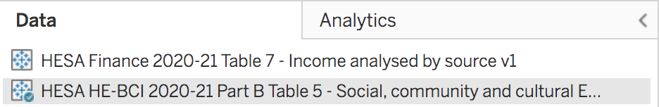
This opens up a dialog box with all the data sources listed. I know we need the 2020-21 Finance data for this, specifically Table 7 which has all the different income sources, so I know what to search for:

I select the one at the bottom and click the Connect button, and now we have another data source:
See the blue tick? That’s indicating that in the current worksheet, HEBCI is our primary data source.
From our new data source, I want to add the field 4: Other income: 4b: Residences, conferences and catering operations: ii: Catering and Conference operations to my worksheet. So I drag it over and organise my fields like so:
So two things to notice. First, see that orange tick? That’s indicating that the income field is being added from a secondary data source that has been blended with my primary data source. The second thing is – how did the platform figure out how to connect them together?
Well, basically, it looks for fields of the same name and joins them that way. If we select the Finance data source in the Data panel on the left of the screen, and look at the dimensions, we can see what its doing: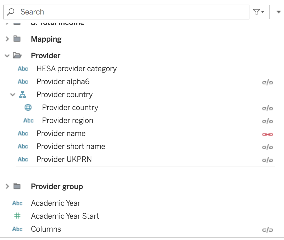
Each of the grey link icons on the right shows what the platform thinks is a possible field to join on, while the red link icons show a join it is currently using. In this case it’s decided to just use Provider name, which is a pretty reasonable guess in this case.
However, we have a problem! The finance dataset for 2020/21 actually contains the previous year as well using the Academic Year dimension, whereas the HEBCI does the same but has folders with different measures for each year. So we can’t join on Academic Year as it doesn’t exist in the HEBCI data source.
So that means we have to drag the Academic Year from the Finance data source to Filters to ensure we only get 2020/21.
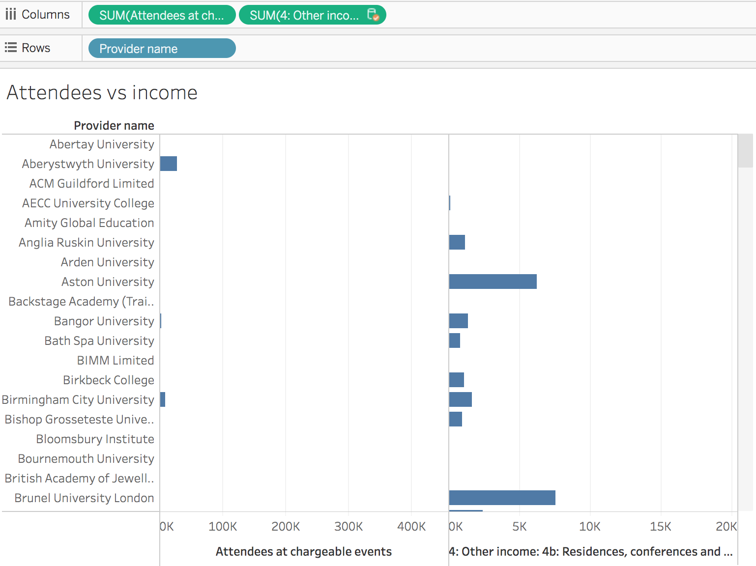
Once I’ve done that, I can mess around with the chart to do something like this:

I’ve added our Academic Year filter, and right-clicked on the measures and chosen Dual Axis to show both measures in one chart rather than next to each other.
Notice how fields from Finance all have that orange tick next to them wherever they are in the worksheet.
Now let’s get fancy and add another data source. This time I’m going to add Student Full Person Equivalent, in exactly the same way I added the Finance data.
Again, it’s going to be joined by Provider name by default, and we’re going to have to add in Academic Year as a filter for this data source as well.
Note that all data sources we add after the primary one are joined to the primary data source, not to each other – so we can’t join Student and Finance on Academic Year, as we’re actually joining each of them with HEBCI.
I want to have a slider so that I can filter the chart I created by total number of students. So to do this, first I create a parameter:
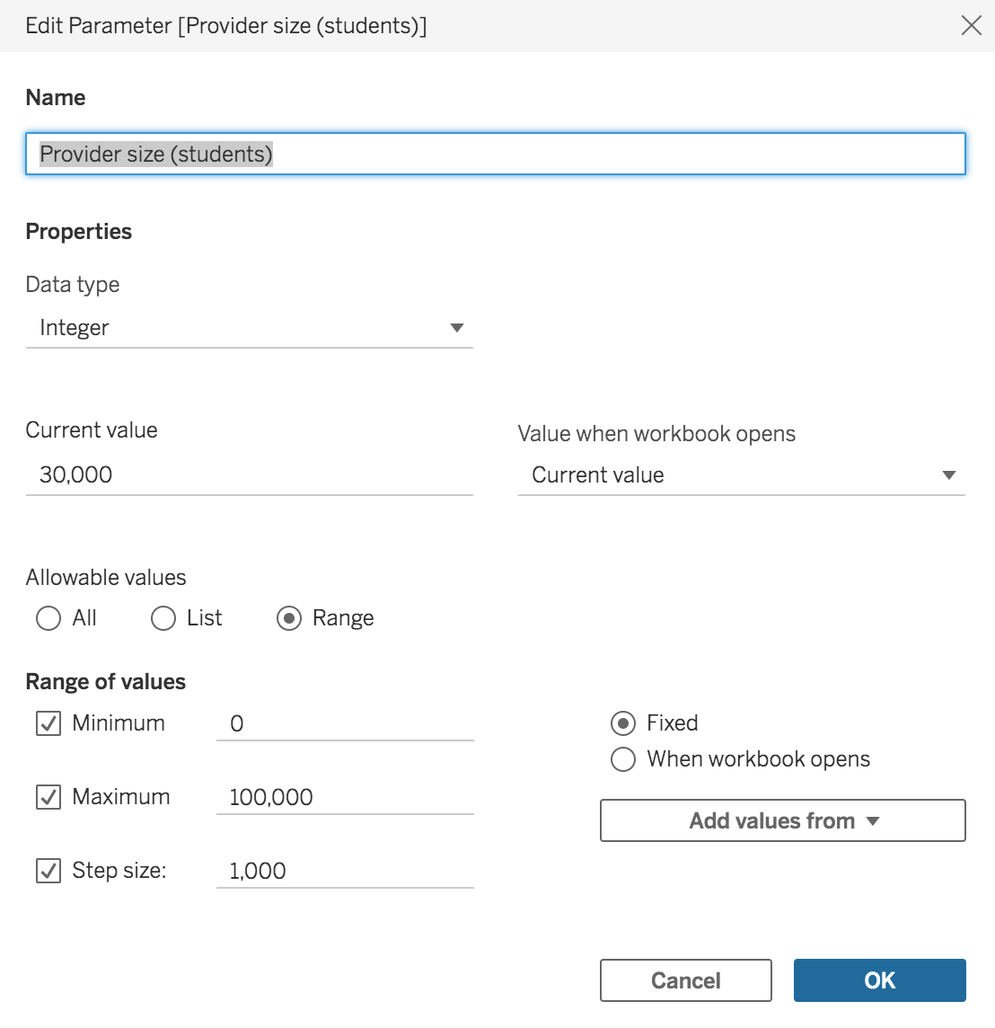
This will let us place a slider on the worksheet that goes up in 1000’s
Now, in the Student data source I can create a calculated field that makes use of this parameter:
![Screenshot of formula: [Full Person Equivalent]> [Provider size (students)]](https://analytics.jiscinvolve.org/wp/files/2022/10/Screenshot-2022-10-13-at-12.31.42.png)
Next, I right-click my parameter and choose Add to worksheet, and drag my calculated field to Filters and select TRUE as the value to include. I now have a provider size control on my chart:
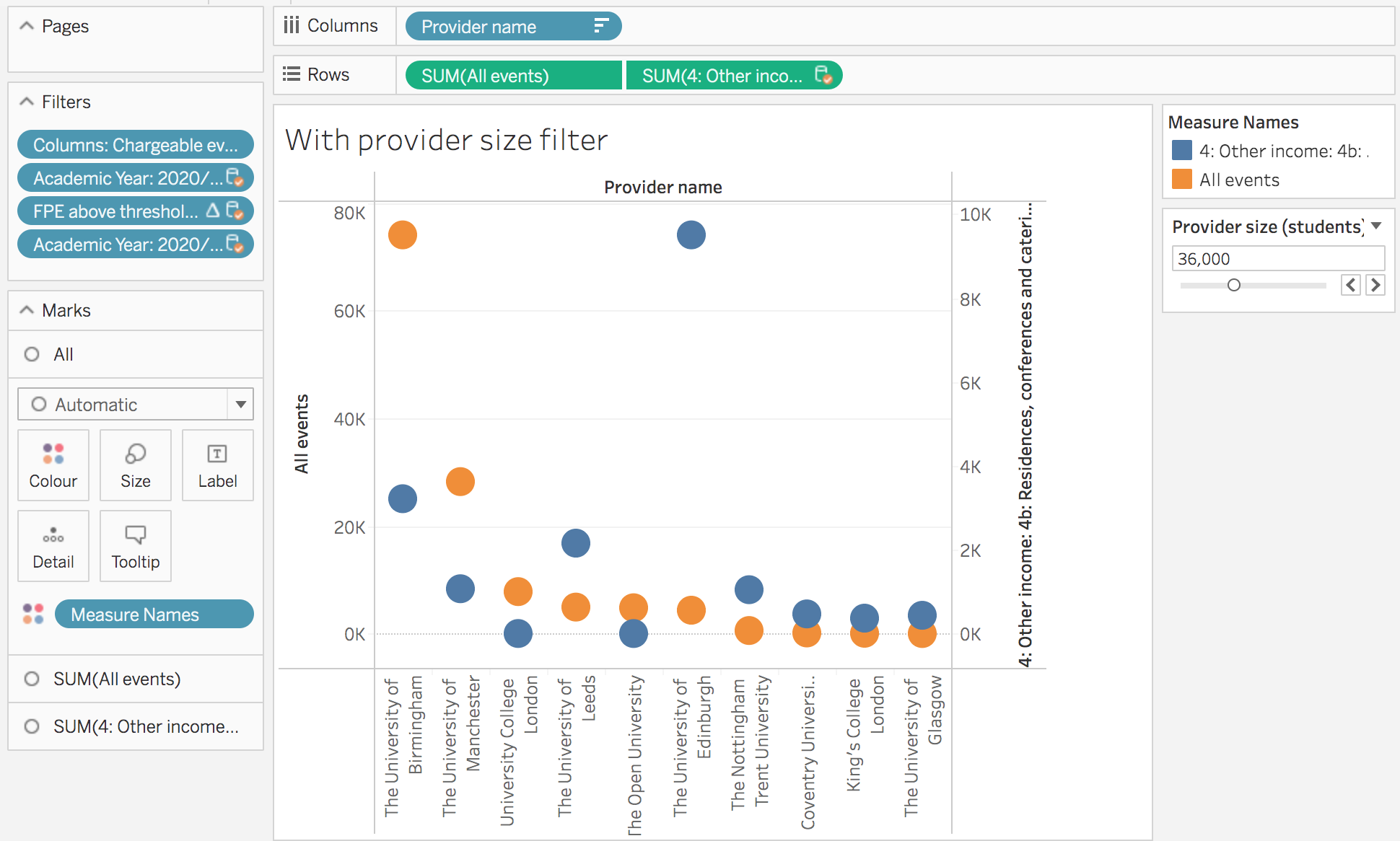
And there we have it – one chart, with three sources of data! Two being displayed as measures, with a third being used to control the display.
Maybe the use case is just a little bit contrived, but hopefully this can still provide a bit of inspiration for ways you can make use of multiple data sources in Heidi Plus.
Just remember to check the joins between the data sources are valid, and in particular that you pay attention to how Academic Years are handled across different datasets, as this is probably the easiest mistake to make when doing this.
Author – Scott Wilson, Senior data and analytics developer, Jisc
You can also follow us on Twitter and LinkedIn to keep up to date with Jisc data analytics.