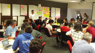
Our app to display learning analytics to students themselves is taking shape. After brainstorming requirements for the app with staff and students at a workshop in London and seeking further input from students at Lincoln University we obtained useful feedback on our draft designs from students at our Summer of Student Innovation (SOSI) session in Birmingham in early August.
Continuing my student app design tour of England, I joined colleagues from Jisc and Therapy Box last week in Manchester to apply the same methodology to app design that our SOSI students have been using. The technique, developed by live|work includes devising personas and user journeys, and competitor and SWOT analyses, defining business and technical requirements, walking through concepts with other teams, and the development and user testing of wireframes.
This was a highly effective process, enabling us in a day and a half of intensive work to narrow down a large number of potential requirements to a manageable feature set, and to tackle key aspects of presentation and navigation. The result is a set of wireframes for the designers at Therapy Box to get their hands on before they start the build.
A major influence on our thinking is the use of fitness apps such as MapMyRide and Google Fit: some of us are already avid users of these technologies. To emulate their addictive qualities in an app for learning is one of our aims. In developing the concepts we were informed by some assumptions which have emerged from earlier work:
- That students can be motivated by viewing data on how they’re learning and how they compare with others
- That making the app as engaging as possible is likely to result in greater uptake and more frequent access to it, with a corresponding positive impact on motivation
- That increased motivation is likely to lead to better learning – with positive impacts on retention and student success
We do of course recognise that the app may have negative effects on some students who find it demotivating to discover just how badly they’re performing in relation to others. However there’s a strong argument that it’s not in these students’ interests to remain with their heads in the sand. Meanwhile if data exists about them shouldn’t we be helping students to see that data if they want to?
Moving on from ethical issues, which I’ve covered extensively in an earlier post, six principles which we want to embody in the app are now explicit. We believe it should be:
- Comparative – seeing how you compare with class averages or the top 20% of performers for example may provide a competitive element or at least a reality check, driving you to increased engagement.
- Social – being able to select “friends” with whom to compare your stats may add another level of engagement.
- Gamified – an app which includes an element of gaming should encourage uptake by some students. This may be manifested in the use of badges such as a “Library Master” badge for students who have attended the library five times.
- Private by default – while data that the institution knows about you from other systems may be fed to the app, the privacy of any information you input in the app yourself will be protected. However anonymous usage information may be fed back to the app backend.
- Usable standalone – by students whose institutions are not using the Jisc architecture.
- Uncluttered – the app should concentrate for the time being on learning analytics data and not be bloated with functionality which replicates what is already present in the VLE/LMS or in other applications.
So let me now take you through the draft wireframes to show how these principles are being taken forward (- click the images to enlarge).
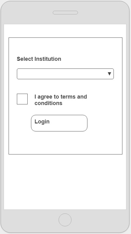
When first logging in the student is able to select their institution from a pre-populated lists of UK universities. If the students’ institution is using other parts of Jisc’s learning analytics architecture, in particular the learning analytics warehouse, then much more data will be available to the app.
For simplicity we’re ignoring for the time being the use case of a student signed up with more than one institution.
But we’re incorporating functionality which we think will be of interest to students regardless of whether their institution has signed up. That’s setting targets and logging their learning activities, about which more later.
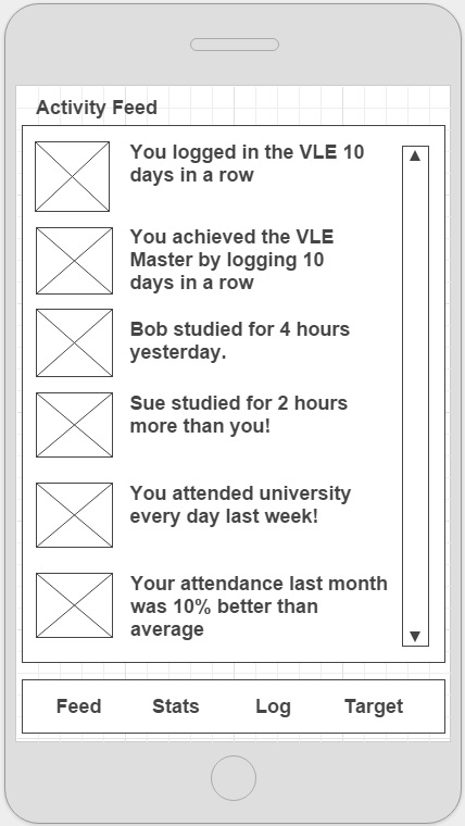 While what should go into an activity feed or timeline is likely to be the subject of much debate and future educational research, we plan to integrate this dynamic and engaging concept, so essential to applications such as Twitter and Facebook.
The wireframes are intentionally black and white and allow space to incorporate images but not the images themselves – in order to concentrate on concepts, layout and navigation at this stage.
Here the images may be of your friends or badges awarded. We include examples of possible notifications such as “Sue studied for 2 hours more than you!” but at this stage make no comment as to whether these would be motivational, irritating or otherwise. Future user testing will help clarify what should be included here and how the notifications should be worded.
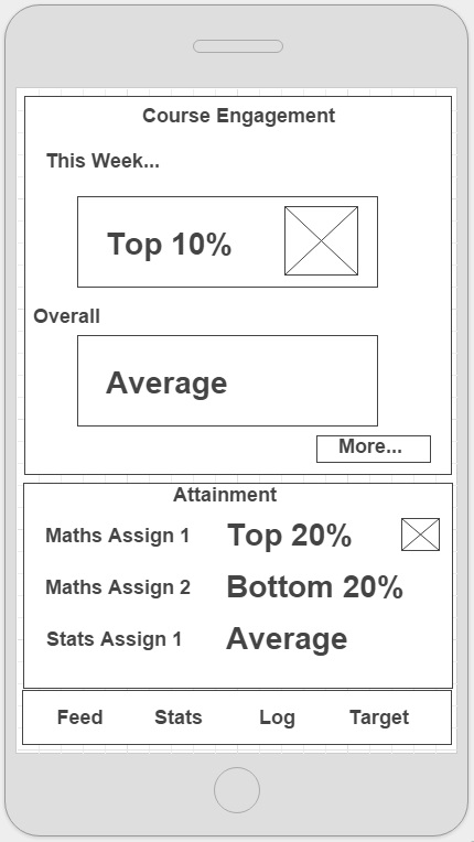 The engagement and attainment overview mirrors what many fitness apps do: it provides an overview of your “performance” to date. Critically here we show how you compare to others. This will be based on data about you and others held in the learning analytics warehouse. It may include typical data used for learning analytics such as VLE/LMS accesses, library books borrowed, attendance records and of course grades.
We’ll research further how best to calculate and represent these comparators or metrics. At this stage we’ve chosen to avoid traffic light indicators for example as these would require detailed knowledge of the module and where the students should be at a particular point in time.
Now let’s see what happens when you click the More button.
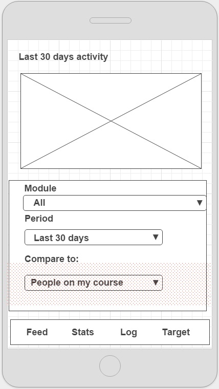
In the activity comparison screen you’ll see a graph of your engagement over time and how it compares with that of others. You can select a particular module or look at your whole course. We’ll populate the drop-down list with options for who you can compare yourself with such as people on my course, people on this module and top 20% of performers (based on grades).
Comparing yourself to prior cohorts of students on a module might be of interest in the future too.
We may show a graph here with an overall metric for “activity” based on VLE/LMS usage, attendance etc. Or we may want to break this down into its components.
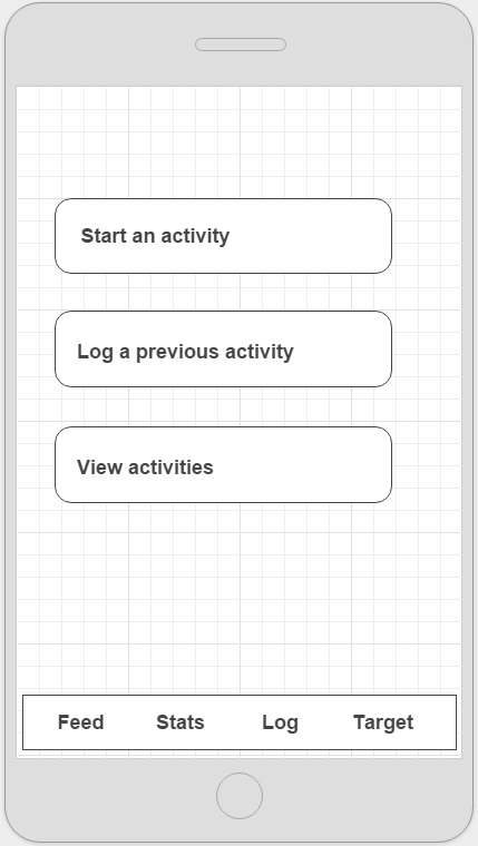
The next feature of the app allows you to log your activities. This is some of the “self-declared” activity that we think students might want to input in order to gain a better understanding of what learning activities they’re undertaking and how much effort they’re putting into each.
Let’s click Start an activity.
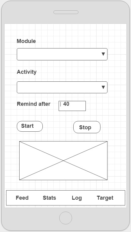 Starting an activity allows you to select the module on which you’re working, choose an activity type from a drop-down list such as reading a book, writing an essay, or attending a lab, and select a time period you want to spend on the activity and whether you want a notification when that period is up.
A timer is displayed in the image box and you can hit the Stop button when you’ve finished. The timer will continue even if you navigate away from the app.
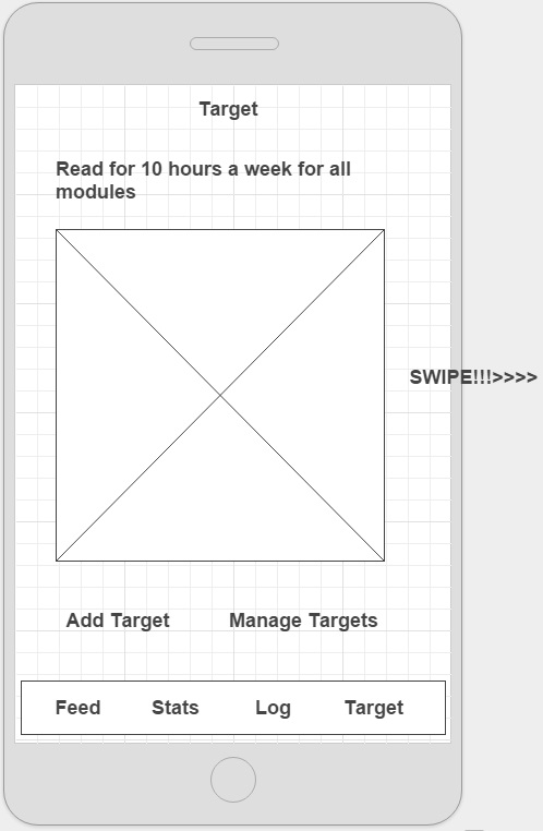 Setting a target is the final bit of functionality we want to include in the app at this stage. Again this is building on the success of fitness tracking apps where you set yourself targets as a way of motivating yourself.
In this example the user has set a target of reading for 10 hours per week across all their modules. The image will show a graphic of how close they are to achieving that target based on the activity data they have self-declared in the app.
Navigation to your next target may be through swiping.
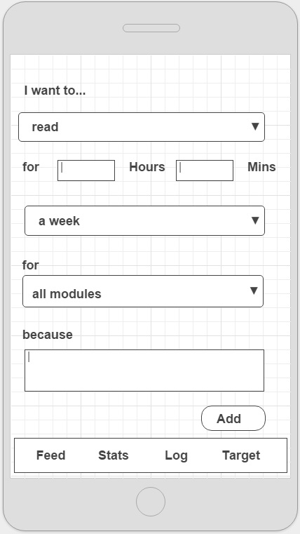 Setting a target involves selecting a learning activity from a pre-populated list and specifying how long you want to be spending on it.
We added a “because” free text box so that learners can make it clear (to themselves) why they want to carry out the activity e.g. I want to pass the exam, tutor told me I’m not reading enough).
Users may be more likely to select a reason from a pre-populated list than to fill in a text field but we’ll monitor this to see whether it’s being used.
We’re also considering the use of mood indicators here to show how happy or otherwise you’re feeling about how you’re getting on with meeting your target. Lots of potential for comparing your mood with others, showing how it’s changed over time or even sentiment analysis by institutions if students want to share such information with them – but that’s one to tackle later.
This doesn’t include all the screens we’ll need but we do now have a pretty good idea of initial functionality to be incorporated in the app, its layout and navigation. There’ll no doubt be a fair bit of tweaking before v0.1 is built but you should get the general idea of what’ll be available from the screens above. We make no attempt at this stage to incorporate predictive analytics, which might show for example if you’re on track to succeed or drop-out. That will come in future iterations as, no doubt, will some of the other great ideas people have come up with that we’re leaving out for this first version of the app scheduled for release in April 2016.