Jisc data analytics has released two new suites of finance trends dashboards in Heidi Plus for subscribers to benchmark themselves and compare key financial data over time (including income, expenditure and research income data). This follows feedback from the user community that the existing finance data was difficult to compare year on year due to each year being published separately. While it wasn’t possible to make everything comparable as some of the data has changed significantly over time, our team have designed these dashboards to provide the best possible benchmarking experience. Below we look at some of the key insights Heidi Plus users can access for free as part of their subscription along with a great new custom benchmarking feature.

Track key financial indicators over time
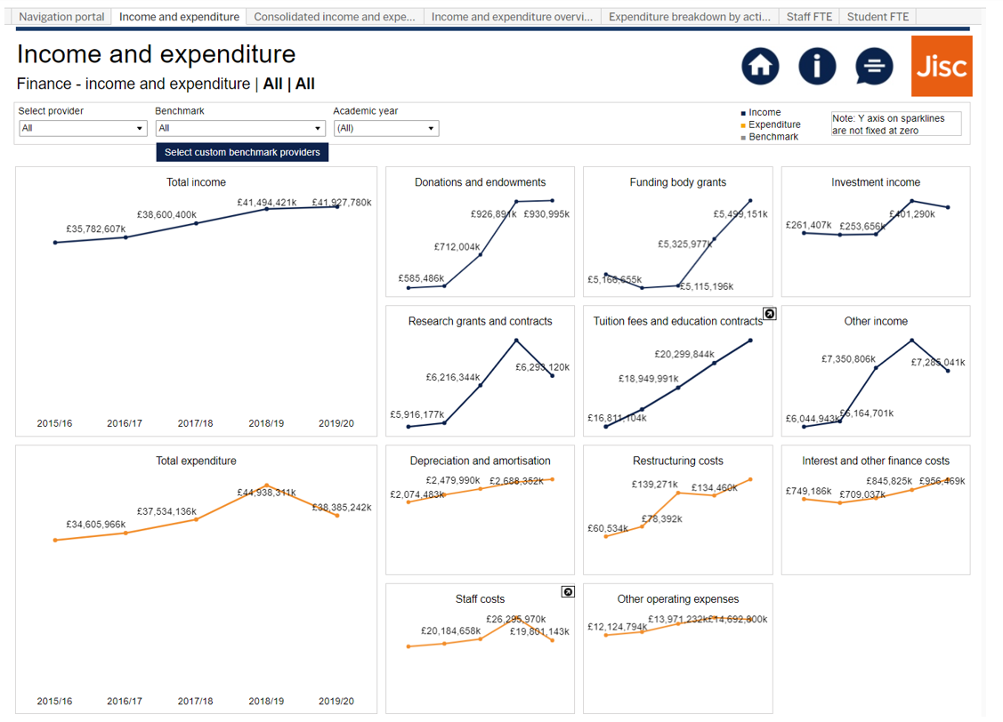
The new finance trends dashboards target the challenge of comparing finance data over time which has historically been difficult. You can see from the dashboard screenshot below that key indicators such as income and expenditure have been combined across years to create snapshot graphics which are easy to interpret and build an instant strategic picture. As well as the financial data, staff and student FTE have also been included as helpful pieces of contextual data.
Analyse research income year on year
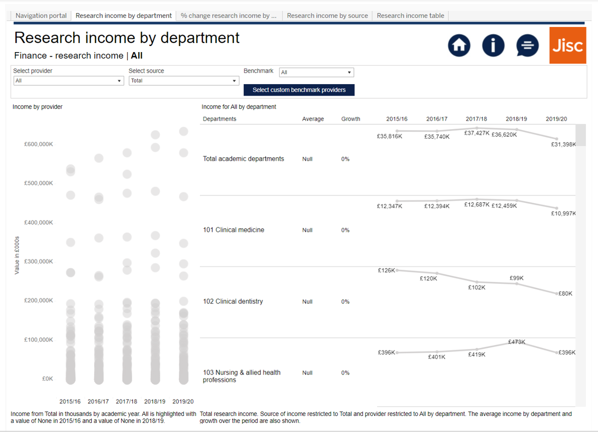
Also included in the finance trends dashboard suite is the ability to analyse research income data across each provider over time. This includes looking at it by cost centre which gives a departmental style view as well as by source showing where the income has come from. The dashboards have been designed in a way that makes sector benchmarking seamless as demonstrated by the chart on the left-hand side of the dashboard screenshot below.
Brand new feature – create your own custom benchmark groups!
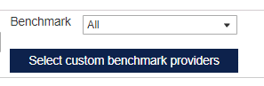
Previously, subscribers to Heidi Plus had the option to benchmark themselves against ready-made groups of other providers such as its mission group. For the first time, users can now create their own bespoke groups in the finance trends dashboards based on whatever criteria they need giving them complete flexibility over their strategic financial comparisons. These groups can easily be changed as comparative and strategic needs evolve.
Full list of finance trends dashboards released in the dashboard centre of Heidi Plus for all subscribers:
Suite 1:
- Income and expenditure
- Consolidated income and expenditure
- Income and expenditure overview
- Expenditure breakdown by activity
- Staff FTE
- Student FTE
Suite 2:
- Research income by department
- % Change research income by department
- Research income by source
- Research income table
Subscribe to Heidi Plus
If your organisation is already subscribed to Heidi Plus, simply contact your Lead Contact to request access. If you’re not sure who this is, you can email our Customer Success team at customer.success@jisc.ac.uk who will be happy to support you.
To see if you’re eligible to subscribe as a new organisation, get in touch by filling in this form and let us know in the further comments section that you found us through this blog post.